Designing a Visitor Passport for a rewilding estate
Back in February I wrote a blog post about working on a mini re-branding project for Hepple Wilds — a conservation and rewilding project on the Hepple Whitefield estate in the Northumberland National Park that's doing some really interesting work for nature. Across their 4,000 acres, the owners of Hepple are committed to balancing access for the local community and visitors alongside helping to keep the landscape species- and habitat-rich, by introducing new ecological improvements and monitoring processes as well as maintaining some areas with minimal human distraction.
The re-branding project led to an invitation to run a sketching workshop on the estate. And that, in turn, has led to a commission to create both an illustrated Estate Map and a Visitor Passport for Hepple Wilds.
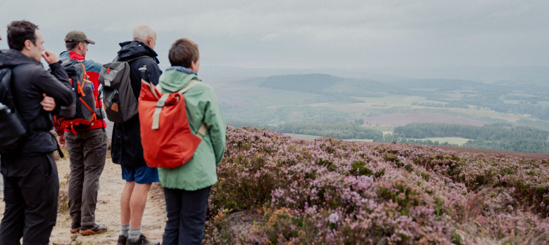
Visitors to Hepple Wilds on a guided tour
Why a Visitor Passport?
Something that I learned working in fundraising is that it costs significantly more in time, money and effort to recruit a brand new supporter than it does to retain someone who already believes in what you do.
Big fundraising charities have whole teams dedicated to donor stewardship. Big brands have retention teams, win-back strategies, loyalty programmes. All of them built on the same insight: that the person who's already chosen you is your most valuable asset, and the relationship doesn't end at the point of transaction. If you could convert a one-off donor into a regular giver, the data showed they were more likely to volunteer, to advocate and bring others in, and maybe eventually to leave a legacy gift. The first gift wasn't a full stop, but the beginning of a conversation that needed to demonstrate not just need but also shared values.
I've been thinking about all of this recently because a Visitor Passport is more than a map, or an introductory leaflet for new visitors - it is a tool designed to give people a reason to explore the estate more deeply, and to come back and discover something new each time. This is even more important at Hepple, because whilst large areas of the estate are open access land - free for anyone to explore - other areas are still privately managed and only accessible via tours and events organised by Hepple Wilds. From the organisation’s perspective, the Visitor Passport gives them the opportunity to tell visitors what else they can do on the estate, providing them with a soft promotional opportunity within a piece of supporter stewardship that connects visitors more intimately to the estate and the work of Hepple Wilds.
The brief
Most smaller heritage and conservation organisations I encounter are working with tiny teams and limited budgets. To help the team at Hepple to achieve their ambitions without overshooting their budget, I suggested that a sub-set of the illustrations could be shared between the Estate Map and the Visitor Passport, thus also helping to ensure that both items work together as part of a coherent visual identity for the estate.
The team at Hepple had already put a lot of thought into what sort of content they wanted for their Visitor Passport, including species checklists for people to tick-off things that they’d seen when visiting, some sort of information about how the estate changes through the seasons, space for visitors to include their own notes and observations and - of course - pages where the visitor could collect stamps for the different tours and experiences that they have attended.
My challenge was to incorporate the work I’d done for their mini re-branding project to create the first piece of printed material within that new visual identity. The Visitor Passport needs to be engaging and accessible, helping to engage visitors more deeply with the landscape and the work of Hepple Wilds so that they understand why it matters.
Starting to take shape
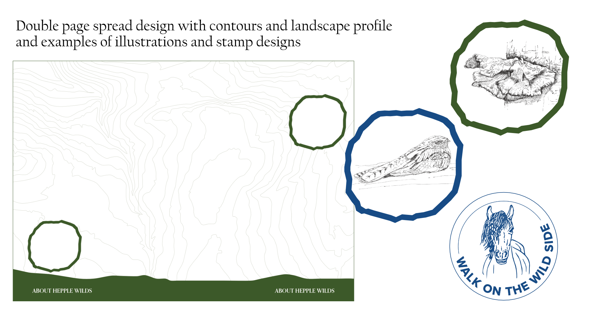
At this point, I always dive head-first into research, looking at both the information I’d been provided with by the team at Hepple as well as looking at examples of visitor passports and engagement tools online. A lot of the examples I found were mostly targeted at children (why should children get to have all the fun?!) and so the style was brighter and more colourful than the ideas that I had forming in my head. I actually ended up looking more at the designs for national passports, which got me thinking about watermarks and the complex geometric and detailed patterns you find in these and how similar these are to contour lines on a map and then on to using the actual contours of the estate, tying the Visitor Passport to the landscape.

Collecting visual inspiration for a Passport design
From there it was a short step to the idea of adding a cross-section/profile of the landscape at Hepple as footer block and then echoing the shape of Hepple Wild’s logo, which is inspired by rock art shapes found in the area, as the framing for my wildlife illustrations.
In the end, we kept the Visitor Passport to just two of the colours from their brand palette (Forest and Summer Skies), whilst the illustrations will all be in a detailed linework style and shaded a soft dark grey. These colour and stylistic choices have helped us to retain a more sophisticated conservation-led feel to the Visitor Passport.
So that everything ties together well, I’ve also designed a set of stamps for the different types of tours and experiences that visitors can book at Hepple Wilds. I drew each of the icons in pen and then vectorised them so that they retained the wobbly lines and hand-drawn feel of the rest of the artwork for the Visitor Passport.
What comes next?
Now that the basic layout for the Visitor Passport has been approved, my next tasks will be to flow in the copy provided by the client, refine the page designs for the different sections and completing c.20 linework illustrations of different species. Once the Visitor Passport is finished I’ll be moving on to the Estate Map project - an A0-size illustrated map that tells the story of how the Hepple Whitefield Estate is being looked after for nature with some sense of this being a snapshot of a moment within the estate’s life that is part of a much longer history (both backwards, and forwards into the future). Whilst the map is not primarily to be used for wayfinding, it does need to allow visitors to orient themselves within the landscape and appreciate the scale and complexity of the Estate and its primary habitats, flora and fauna.
The bigger picture
One-off projects are always interesting, but it is always most satisfying when I find a client who wants to build a longer-term relationship across multiple projects. There's usually more time for me to really get under the skin of the organisation, what they stand for and the stories that they're trying to tell.
This brief is one of the most interesting that I've taken on. The map is a piece of nature interpretation, with the aim to help visitors understand that they're standing inside a landscape with a long past and a carefully planned future: a place that's actively being shaped for nature, with habitats being created and restored across the estate. It needs to convey scale, complexity and ecological richness — four primary habitat types and 40 spot illustrations of key flora, fauna and orientation points — while also giving visitors enough grounding to find their way around.
Where the map will help visitors understand the estate, the Visitor Passport will be a key tool in building a longer and deeper relationship — encouraging people to notice things they might otherwise walk past, to come back at different times of year, and to feel genuinely invested in what's happening there.
If you're working on a visitor engagement project for a conservation, heritage or countryside estate and you'd like to talk about what illustrated maps and nature interpretation could do for you, I'd love to hear from you. Take a look at my Commissions section and fill in the enquiry form.