Into the medieval: researching a Timeline Wall for the Living Barracks Museum
Earlier this Spring I responded to an open call for artists to provide illustrations for a Timeline wall for the new Living Barracks Museum here in Berwick-upon-Tweed. The brief seemed made for me, as someone who read History at University and has had a lifelong interest in heritage and as a Berwick-based illustrator looking to work on some more challenging commissions - and I’m so pleased to share that I was accepted to work on the project!
This is a project with real local significance — the Living Barracks is a landmark building in the town and the new museum will tell the story of Berwick's complex, layered history to a wide audience of residents and visitors alike. I loved the old civic museum (Berwick Museum & Art Gallery), but I’m really excited to see how the new Museum develops!
Following a kick-off meeting with the project lead from English Heritage, I’ve spent the past month immersed in research (a combination of my own visual inspiration research alongside some fantastic resources provided by English Heritage) and recently submitted some first concepts to the team.
Why a Medieval Timeline?
Whilst modern-day Berwick seems like a sleepy seaside town, this has not always been the case.
David I of Scotland established Berwick as one of his chief burghs in the period 1119-24 and throughout the 12th and 13th centuries the town was a thriving trading hub, and Scotland’s most southerly port. In fact, it was the second largest economic centre in the British Isles, with only London surpassing it. Large quantities of wool were transported down the River Tweed and then shipped to the continent, where it was used for the production of high quality fabrics. The monies raised through Berwick helped to establish monasteries, castles and institutions that lay at the foundations of medieval Scotland.
From the late 12th century until 1482, Berwick's ownership was frequently contested, with conquest and reconquest by the armies of England and Scotland as they competed for strategic advantage. After changing hands around 13 times (with significant bloodshed each time!), Berwick was finally retaken for the English by Richard, Duke of Gloucester (later Richard III), in 1482 – and it has remained in English hands ever since.
The remains of its turbulent past can still be seen today.
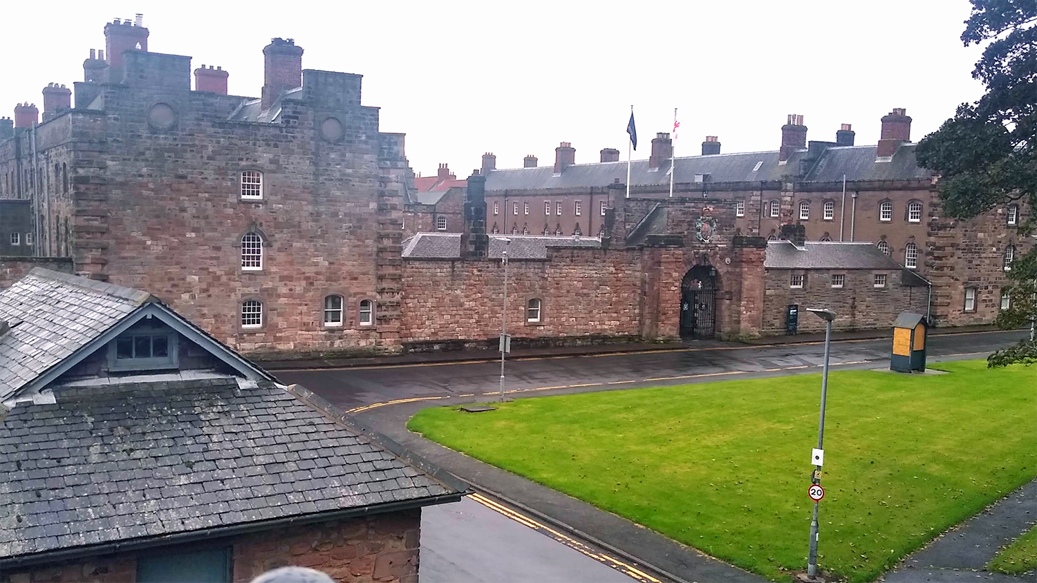
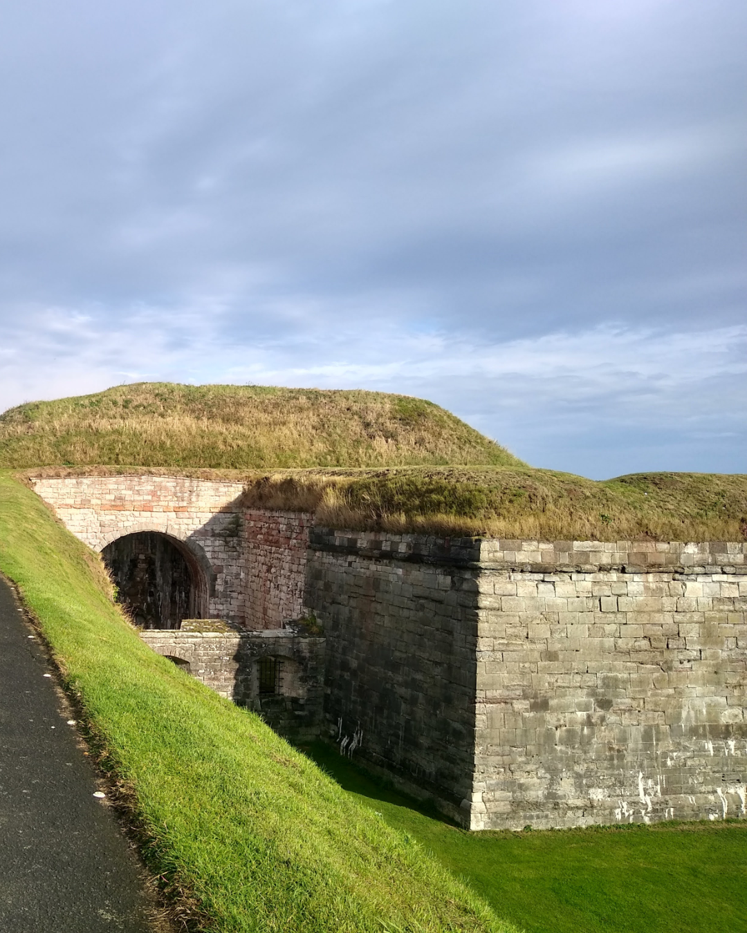
Berwick has two sets of town walls, the first set (of which only fragments now remain) were started by Edward I. The later Elizabethan Walls (which are still complete) are a mile and a-quarter in length and include a combination of massive earthwork ramparts with thick stone walls. The ramparts completely surround the town, with four gates through which entry to the town is enabled. These Elizabethan Walls are the only example of bastioned town walls in Britain and one of the best preserved examples in Europe. The Barracks building itself (where the new Living Barracks Museum will be located as part of a heritage and cultural hub for the town) were built in the early 18th Century and are one of the oldest examples of purpose-built military accommodation in England. They were built in response to the Jacobite rising of 1715, which aimed to return James Stuart to the throne. Although unsuccessful, the uprising highlighted how easy it was for hostile forces to gain ground into England via Scotland and it was agreed that a permanent garrison of soldiers was needed to guard this key strategic position.
The brief and its constraints
The brief involves creating illustrations for seven panels on the Timeline wall, featuring events from Berwick's medieval past.
The illustrations will ultimately be printed onto duratran film and be backlit by lightboxes and therefore the designers recommended that they need to be muted or monochrome illustrations with bold details. The scenes can’t be too detailed, or have too many people or things and they also need to include representation of some of the objects/exhibits that might be found nearby in the gallery. Each scene will have an accompanying quotation, which also needs to be included in the illustration.
As I thought about these requirements and constraints, I was already starting to imagine how I would respond. It felt like the brief needed illustration that was bold, high-contrast and not too busy and I was really interested in how to best deliver this.
Down the medieval rabbit hole
I’m not sure if it is because I’m a historian at heart, but the research part of any project or commission is genuinely the bit I love the most!
During my conversation with the project manager we discussed the idea of creating illustrations in a ‘Medieval-style’ and so I began by looking at the imagery of the 12th and 13th centuries - the period covered by the timeline - and representing the height of the Romanesque tradition in art. Fortunately, there are a wealth of beautifully-preserved or conserved manuscripts from this period and so it is relatively simple to build up a strong picture of the style: generally flat, heavily-stylised figures depicted with elongated bodies, angular faces, large soulful eyes. Figures usually face out, towards the viewer (adding to the ‘flat’ impression). The illustrations are often hierarchical, with more important figures or elements represented as larger - there is little to no perspective in scenes, which are often decorated with pattern or texture.
I felt that the style really fitted the brief for illustrations that contain bold, limited detail and it even hits a contemporary social media trend: stick ‘Medieval cats’ into the search bar of Instagram or TikTok and you’ll see what I mean!
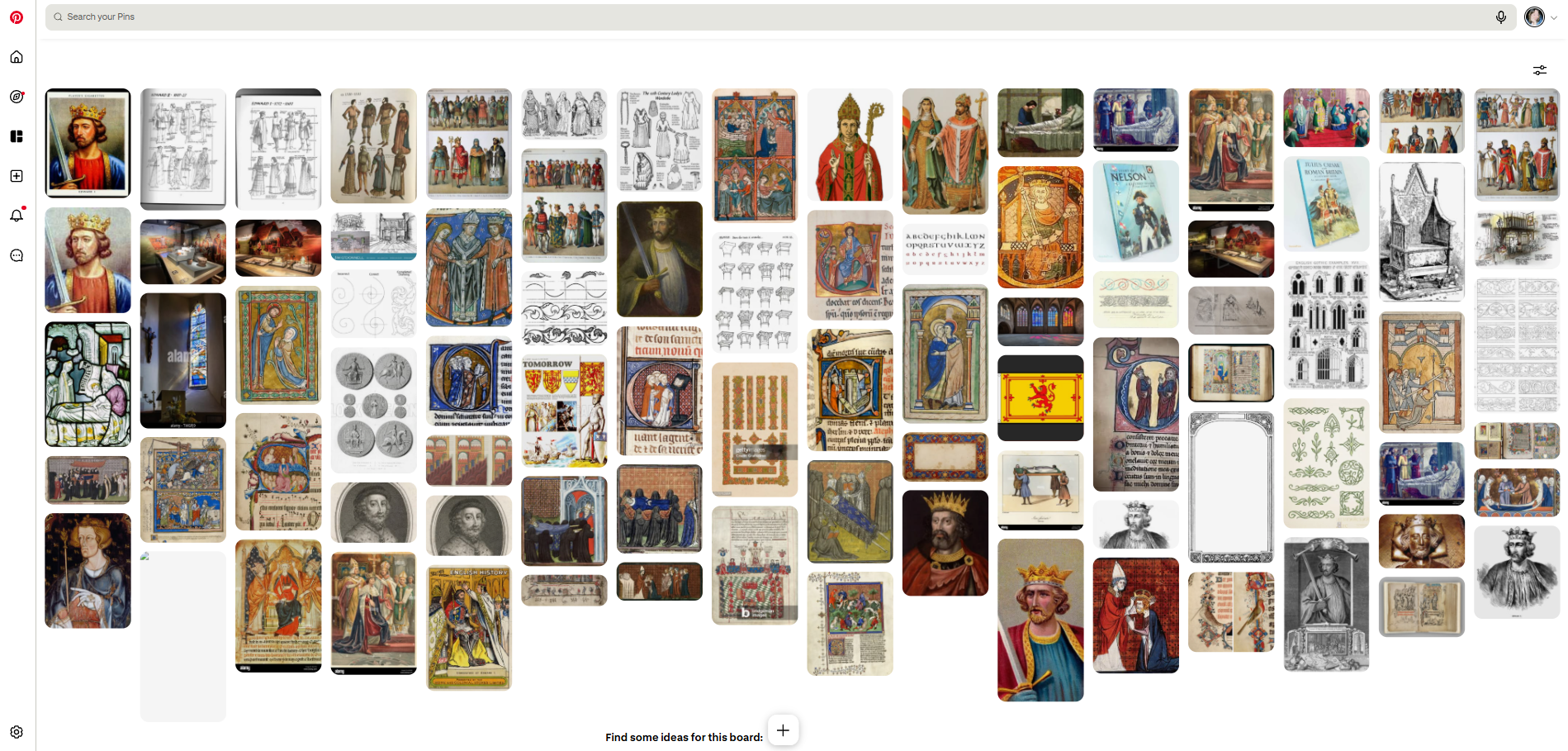
My Pinterest Board full of inspiration
Alongside my own image research, the English Heritage team have provided a wealth of images of artefacts and manuscript sources and this is now all funnelling in to my thinking about how the illustrations might come together.
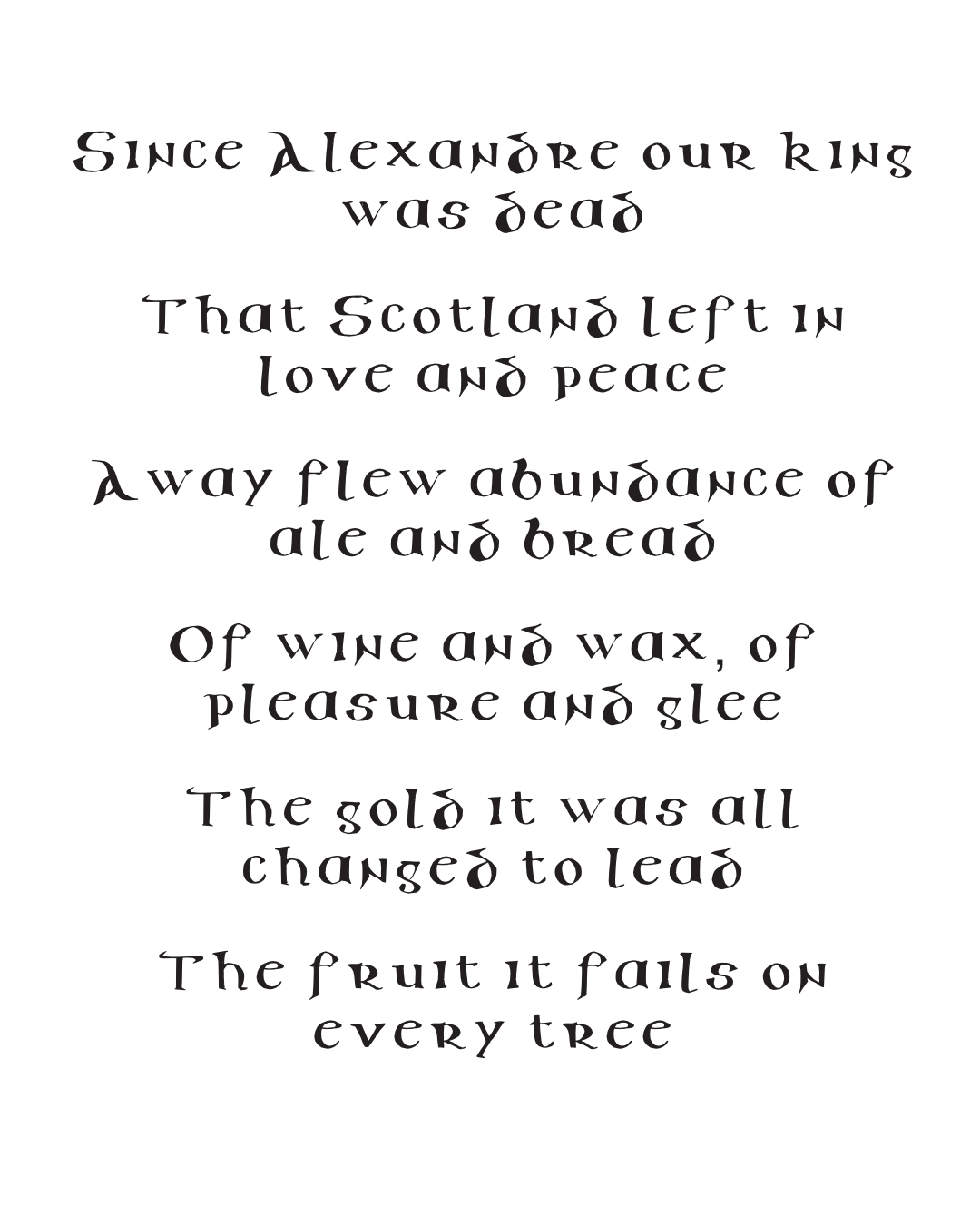
I was also simultaneously thinking about how to treat the quotations that need to go alongside and/or be embedded within the illustrated scenes. I thought it would be interesting to explore hand-lettering these, but I didn’t want the process to be too time-consuming (as I’m not exactly a professional scribe!) and I also wanted to ensure that the writing remained easy to read for a modern audience. In the end I turned to my trusty ‘The Calligraphy Source Book’ by Miriam Stribley and opted for an uncial-style alphabet. Uncials were a development of Roman carved capitals and the English Uncial and Half-Uncial alphabets were a specific early uncial form which started to include ‘half-uncials’ - the precursor to our modern lower case lettering. I drew out the alphabet with a thick black pen and then scanned this as I wanted to retain a textured, hand-drawn element to the final work. At this stage, I used an online font-creator tool to transform my hand-drawn letters into a font set that I could use in my design software, allowing me to simply type out the quotations without me needing to arduously hand-letter each word and it is also a nod to my process: rooted in historical sources, but made practical for a contemporary design process.

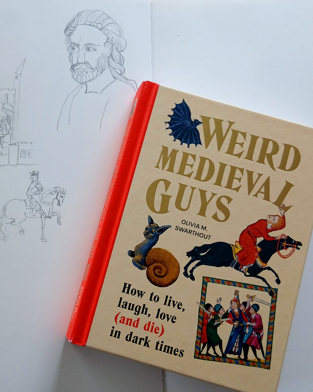
Weird Medieval Guys
During my research I stumbled across a brilliant Substack publication called Weird Medieval Guys that was full of information about Medieval life and art. In fact, I found it so useful that I quickly ordered Olivia's book - Weird Medieval Guys: How to live, laugh, love (and die) in dark times - which is a hilarious and fascinating introduction to life in the Middle Ages, full of quizzes (should you court the girl?), how-to guides, diagrams and charts that take you from birth to death, dispensing wisdom for life along the way.
I highly recommend it if you’re even remotely interested in Medieval history!
Two concepts, two visual languages
The concept stage is where creative thinking becomes concrete and as with any complicated design project, the client was interested in seeing not just how the illustrations could work in a single concept (my Medieval-inspired style) but also wanted to see a concept that was set in contrast to this, for comparison.
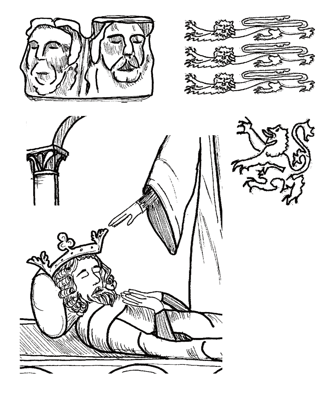
For the concept development, I decided to focus on the most complex panel, composition-wise - Turmoil - which needed to incorporate two separate but linked illustrations describing the death of the Scottish King Alexander III and the coronation of Edward I of England. These events marked the end of Berwick's peaceful heyday as a prosperous Scottish burgh and ushered in centuries of turbulence and warfare.
Concept 1: Medieval-inspired
Obviously the first concept that I prepared was inspired directly by my Romanesque manuscript illustration research. I've contained the illustrations in frames to echo how illustrations appear within Medieval manuscripts and noted that if this is the chosen route I'd add more basic geometric or decorative elements. For the concept work, I stuck to including just two elements connected to the content: the Scottish Lion Rampant and the English three lions passant guardant from traditional heraldry. The primary illustrated scenes were created using just two different pen line weights and I deliberately left quite a lot more white/blank space than would be found in traditional manuscript illustrations as per the brief. I also proposed including related gallery exhibits, where relevant, within the illustrated scenes. For example, a set of hood mould heads and a decorative capital, both of which are based on real exhibit photos that English Heritage provided me with.
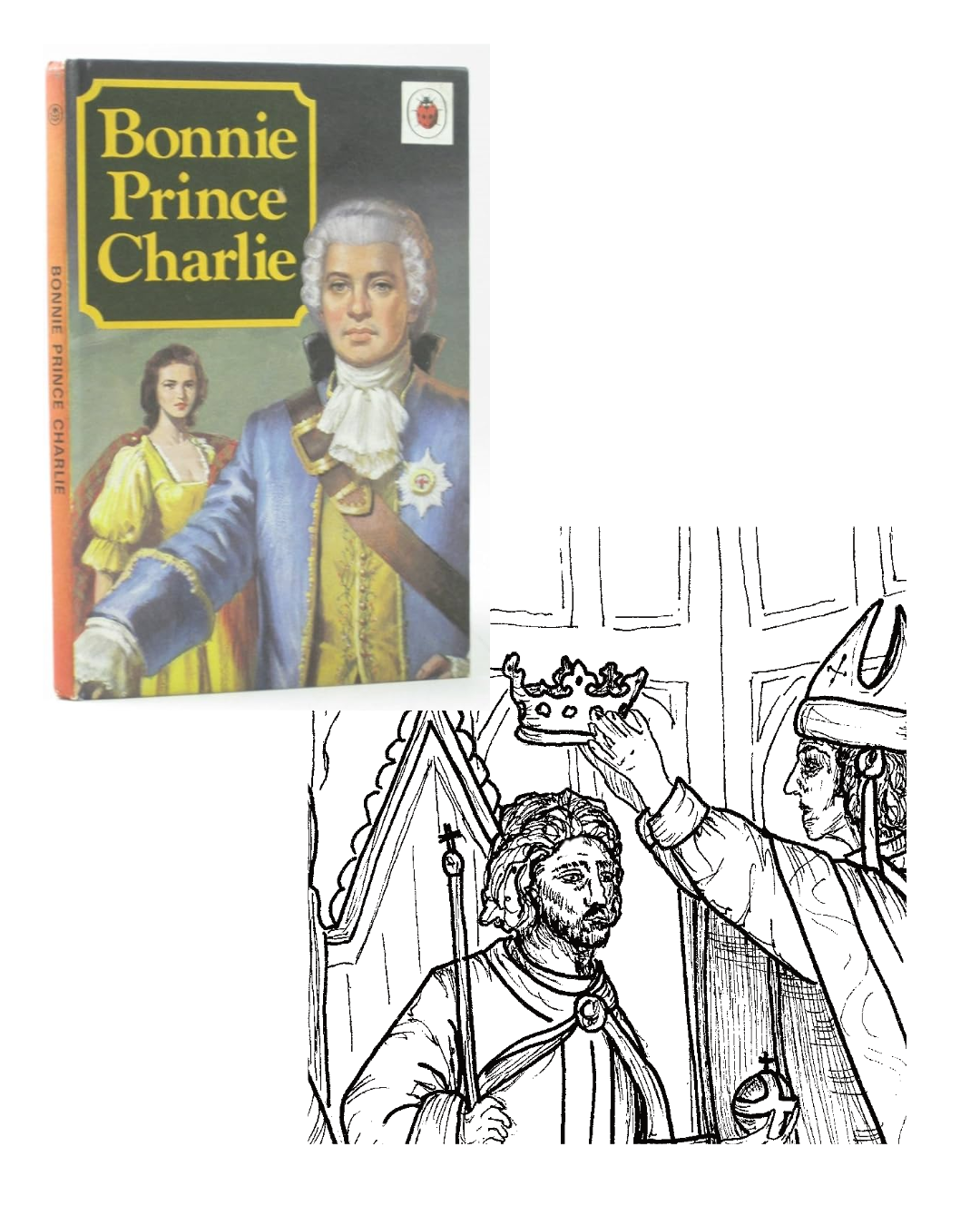
Concept 2: Vintage children’s history books
For my second concept, I was inspired by the covers of vintage Ladybird history books for children (I have fond memories of one I had as a child that focused on Bonnie Prince Charlie!) This style is more figurative and illustrative and although I’ve still only used two different line weights to keep the design simple, I rendered more shadow and dimension as well as composing the characters more naturally (ie not facing the viewer). I aimed to leave the backgrounds to recede, so that the central characters/elements are stronger. Again, I’ve added in the representations of the nearby gallery exhibits and kept to a more traditional typographic font for the treatment of the quotations.
What comes next
I’ve submitted the concepts to English Heritage and we’ve a feedback session booked in for mid-May - wish me luck and I’ll share more as the project develops!