Illustrating Wilson’s Tales of the Borders: Research and Early Foundations
Since receiving grant funding back in September to begin my project inspired by JM Wilson and his Tales of the Borders, I’ve been taking some time to lay the groundwork for the illustration part of the project. Instead of diving straight into drawing, this early stage has been about slowing down and spending time with the stories themselves — getting a feel for the characters, settings, and themes before trying to respond to them visually.
Getting to know some Tales
As part of my grant application, I asked for funding to allow me to spend some time developing a new series of 10-15 illustrations relating to some of Wilson’s Berwick-based Tales. I’ve decided to focus on three Tales for which I couldn’t find many original illustrations, but which are also central to the Walk with Wilson self-guided walking trail leaflet that I’m also working on for this project. The Tales are: Patrick Hume and the Governor of Berwick, Launcelot Errington and His Nephew Mark – A Tale of Lindisfarne, and Grizel Cochrane – A Tale of Tweedmouth Muir.
Notes and more notes
Although these Tales are very different on the surface, they’re connected by their focus on characters who step outside the law but follow a strong moral code. These are stories about loyalty, courage, and ingenuity, and reading them together I was struck by how clearly this idea of the ‘heroic outlaw’ runs through Wilson’s writing. I also really liked that these Tales had strong female characters - even when they weren’t the main protagonist!
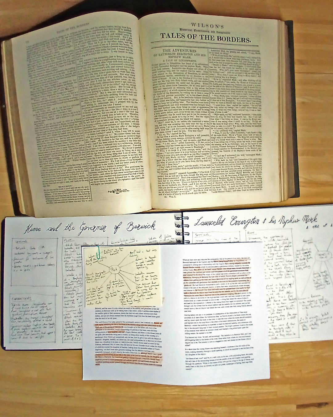
As part of the research phase, I went back to the Tales in their original form and read them slowly, annotating as I went. I made notes on plot and setting, but also on tone, atmosphere, and moments that felt especially visual. Approaching the texts as an illustrator rather than a casual reader helped me see them not just as stories, but as a starting point for the images I’ll be developing in my next phase of work.
I also started writing this all down in my Project Workbook, where I’m keeping a track of my thoughts, processes and exploratory drawings as a visual record.
Collecting visual inspiration
Once I’d spent time getting to know the stories on the page, the next step was to start thinking visually. I began gathering sources of inspiration into a set of moodboards, looking for images that could help me translate the stories I’ve chosen into line, texture, and tone.
One of the things that drew me to Victorian illustration was how often the images have a strong use of contrast, driven in part by the printing technologies available at the time. Techniques such as wood engraving and etching relied on black ink printed on white paper, encouraging artists to think in terms of light and dark rather than colour. This resulted in images built from bold areas of shadow, crisp outlines, and dense cross-hatching, with highlights often left as untouched paper.
High contrast was not just a technical necessity but a storytelling tool. Dramatic shifts between darkness and light were used to heighten atmosphere, guide the viewer’s eye, and emphasise moments of tension or emotion. Figures often emerge from deep shadow, while faces, hands, and key actions are picked out in light, giving scenes a theatrical, almost stage-lit quality.
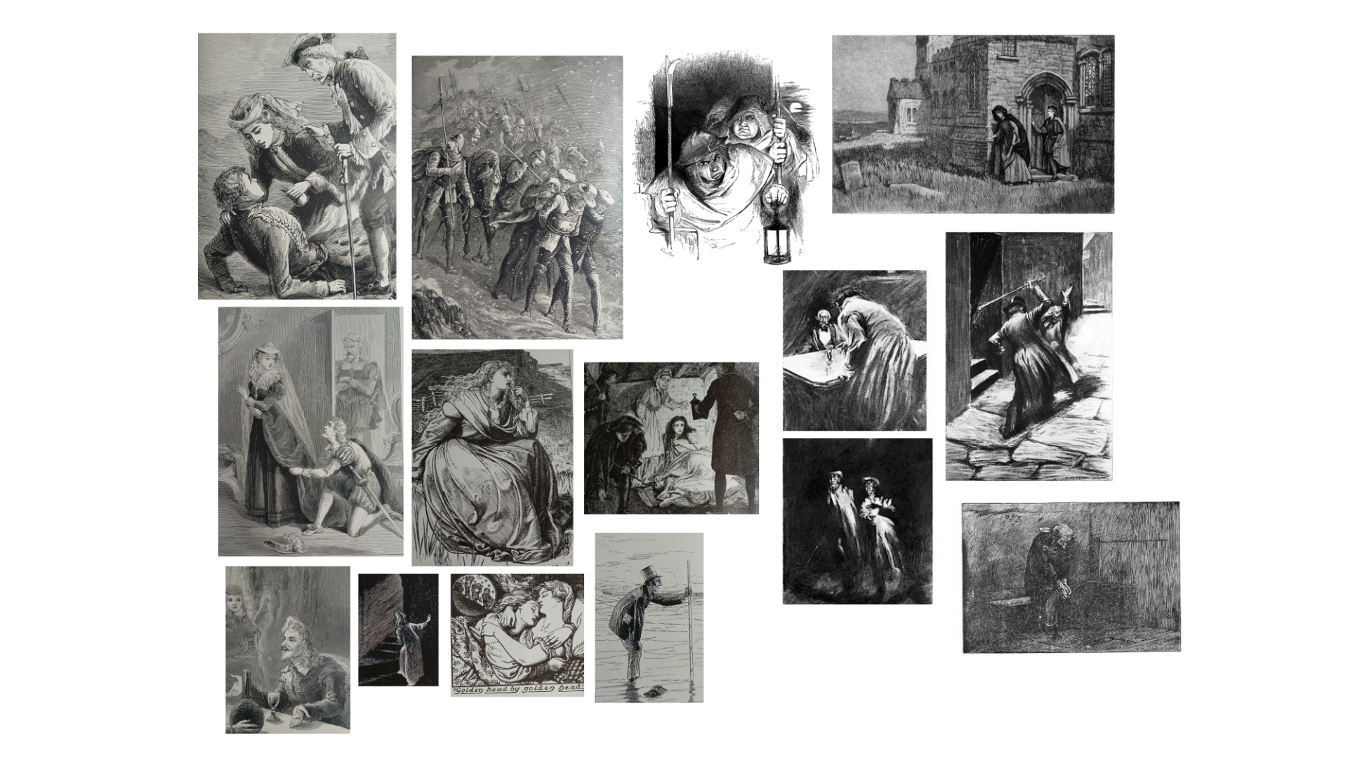
My moodboard of Victorian-era illustrations
I felt that Charles Raymond Macauley’s work in particular reflected this theatrical use of light, but I also loved George Cruikshank, Henry Macbeth-Raeburn and John Leech.
Once I’d spent some time exploring Victorian-era illustration, I turned to some research of the approach of contemporary illustrators using ink as a medium and found that these artists share a similar reliance on strong black line and high contrast, but often used in different ways. Modern ink illustration, while often inspired by traditional usage, tends to use contrast more freely and experimentally. Contemporary illustrators often push black and white to extremes, simplify forms, or allow large areas of solid black (or white) to dominate an image for emotional impact rather than descriptive detail. Where Victorian illustration often aimed for narrative clarity and realism, modern ink work is more likely to prioritise mood, expression, and personal style, using contrast as a tool for atmosphere as much as storytelling.
Some illustrators whose work I was drawn to include: Chris Riddell, Rohan Easan, Philip Harris, Anna Tromop and Eri Griffin.
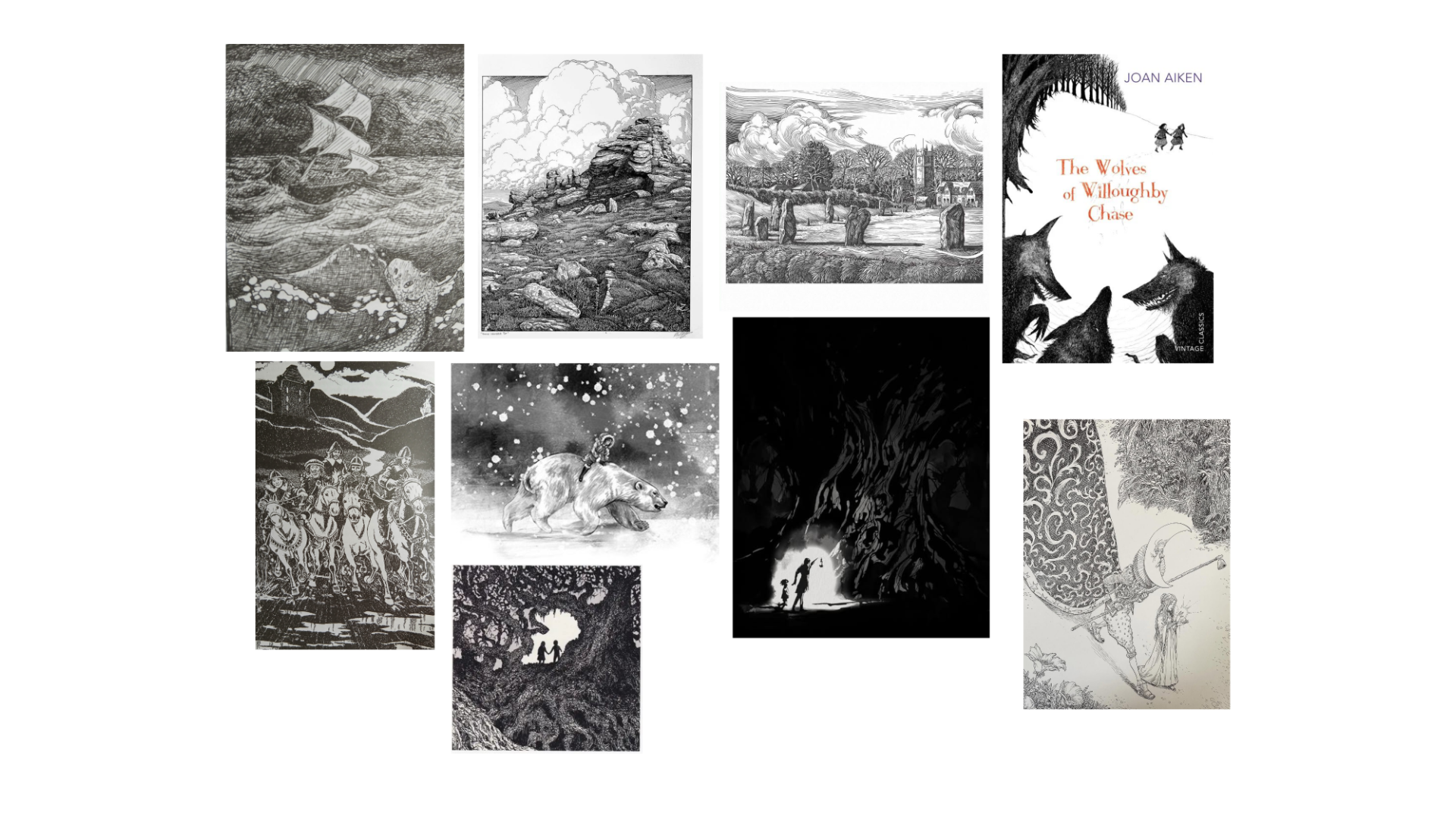
Some of the contemporary illustrations that inspired me
In all the contemporary work, I love how there’s the mix of fine detailed linework with a much more fluid use of large areas of ink - either solid black or as washes. As I currently work mostly in an ink style that relies on fine lines of detail and less on big areas of dramatic contrast, I’m really keen to explore how I can push my own practice in this direction.
What’s next?
Having time to spend on research was a really important element of this project for me. As a relative new-comer to illustration, I've not yet had the opportunity to focus on my own artistic practice and develop a style, techniques or approach that feel authentic to me. Thanks to the grant funding, I'm having the space within this project to go into more depth: identifying elements of visual story telling that are important to me and that I'd like to experiment with.
As someone who studied History at University, the heritage context of this project has been an absolute joy and I’ve loved finding out more about Victorian and contemporary ink illustration, as well as starting to dig into my chosen Tales in more depth. I’m coming to accept that this first phase was ‘preparatory’ research, as I know the historian in me won't be happy unless I also allow myself to spend some additional research time to inform costume, hairstyles, objects and settings for each of the Tales I’m working on.
Spending time reading, annotating, and gathering visual references has helped clarify what draws me to these Tales and how I might begin to respond to them as an illustrator. In my next post, I’ll be sharing more about my Experiment and Explore stage, including some of the early practical work I’ve been doing with ink and my first steps into character drawing.
Sign-up to my mailing list to get the next instalment of my project updates through my monthly newsletter - Notes from Northumberland.
