From Saddle to Sketch: Illustrating the Riding of the Bounds of Berwick-upon-Tweed
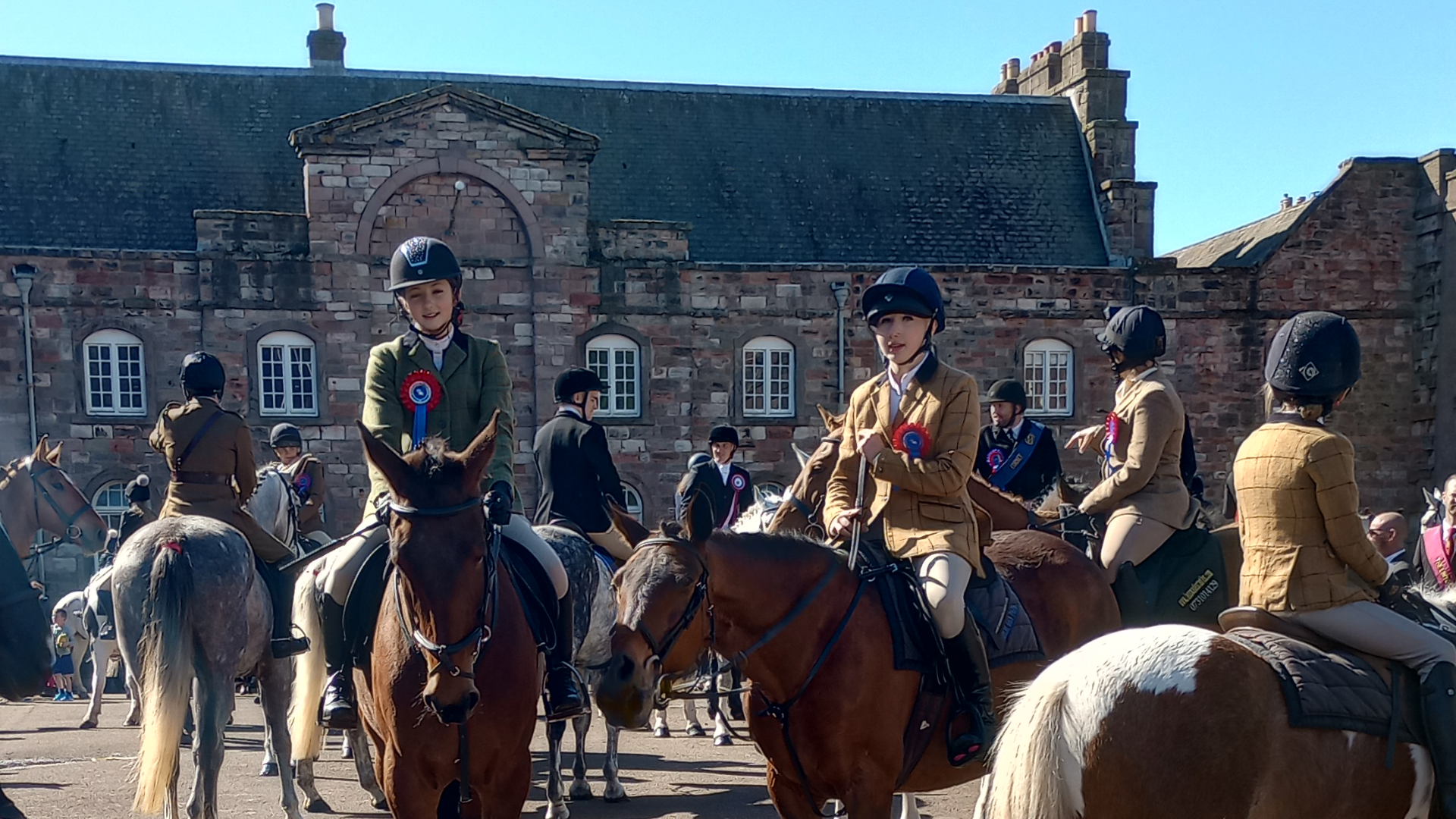
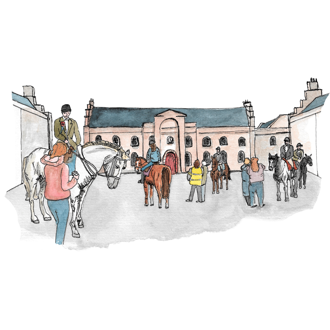
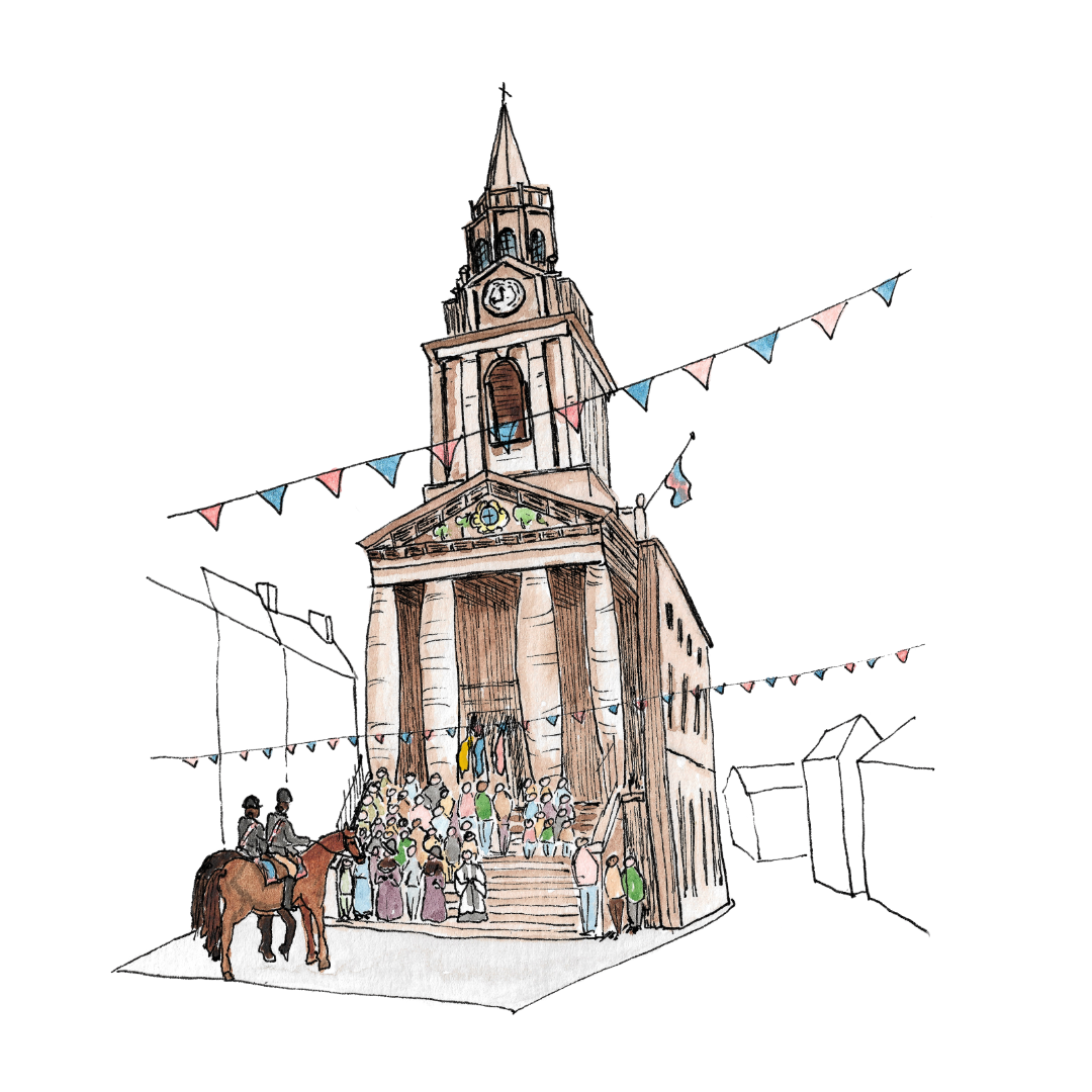
Every year on the first Saturday in May, the people of Berwick-upon-Tweed (and beyond) gather to watch a spectacle that has been witnessed here for more than four centuries. Horses - beautifully groomed - arrive at the eighteenth century Barracks building to assemble on the parade ground, riders don sashes and rosettes, and the sound of hooves rings out across the cobbles. The annual Riding of the Bounds is a living tradition that traces the town’s historic borders, reaffirming Berwick’s unique identity on the edge of England and Scotland.
History Meets Art (The Living Tradition)
So when photographer and web designer Sarah Jamieson got in touch about creating a bespoke illustrated map to anchor the new website that she was designing for the Berwick Riders Association to help tell its story visually, I knew it would be a special project — one that celebrated not just geography, but heritage and community spirit. The Berwick Rider's Association is a passionate community of riders, volunteers, and supporters dedicated to preserving one of Berwick-upon-Tweed’s oldest and most cherished traditions. The commission would include a detailed map of the route taken by the riders, alongside ten smaller icon-style illustrations inspired by their traditions and symbols.
As a historian at heart, I was immediately drawn to the brief. This wasn’t just about plotting roads and rivers. It was about conveying movement, meaning, and memory. How do you translate a centuries-old ritual, full of noise and colour, into an illustration that provides context and orientation, but still feels alive?
Mapping Movement and Meaning
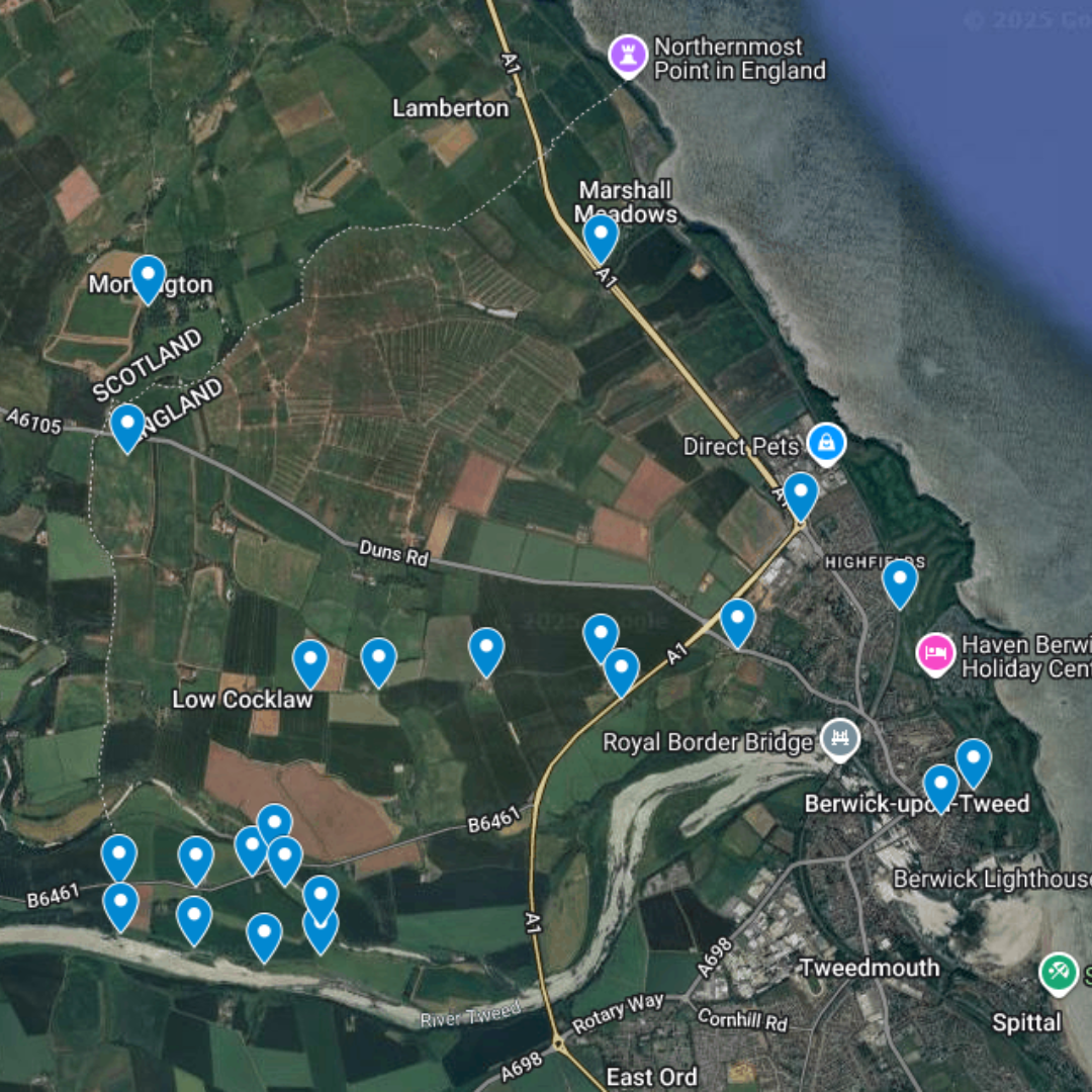
The custom map design itself posed a fascinating puzzle. The Riding of the Bounds follows a roughly circular route around the outskirts of Berwick between the River Tweed and the present day Scottish border, meaning that a straightforward depiction risked leaving large stretches of empty space in the middle that was irrelevant to the ride and which, frankly, doesn’t contain a lot of anything beyond farmland.
I wanted the map to flow and to echo the rhythm of the riders’ journey, while still clearly showing key locations — from the send-off at the Guildhall to riding the Border Wall, lunch and games at Gainslaw Hill Farm, and the final return back into Berwick. Finding the balance between accuracy and artistry became part of the story, much like the Riders finding their way safely “oot and in.”
I therefore chose to play around with the base map - skewing it to reduce the ‘dead’ space. As a heritage illustration project, I didn’t want to just capture geographical landmarks, either. I decided early on to make the horses and their riders the heroes of the design, including stand-alone illustrations of elements of the Riding of the Bounds semi-integrated into the relevant parts of the map, but experimenting with scale to make sure that these images were ‘readable’.
Following the Riders’ route
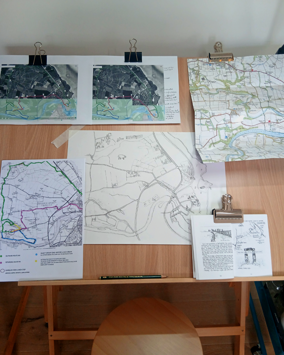
Like the Riders themselves, my creative journey began with a moment of gathering — an “assembling at the Barracks.” I started by researching the history and route of the Riding of the Bounds, poring over maps, local photographs, and images from past events. I wanted to understand not just where the Riders went, but why each point along the way mattered.
From there, the first sketches began to take shape — a tangle of pencil lines and rough marks that hinted at the movement of the horses across the landscape. I experimented with ways to let the route lead the viewer’s eye, much like the Riders winding their way through town and countryside. At this stage, the challenge was to make geography feel dynamic: the map had to read clearly, but it also needed energy and rhythm.
As I moved on to refining the layout — I hit my own version of the Border Wall (something I sincerely hope doesn’t happen to the Riders!) I wasn’t happy with how the map was coming together — the elements felt disjointed and unconnected. So at this stage I redrew the base map to reduce the amount of detail, played with scale and perspective to try to make the circular route feel more balanced and full, adjusting the spacing of roads, rivers, and woodland and adding in more detailed map icons to help the viewer orient themselves within the geography of the event.
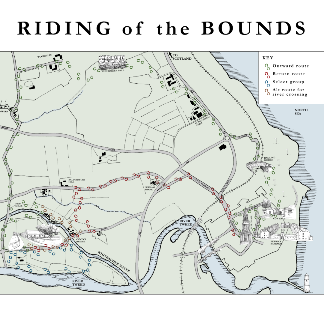
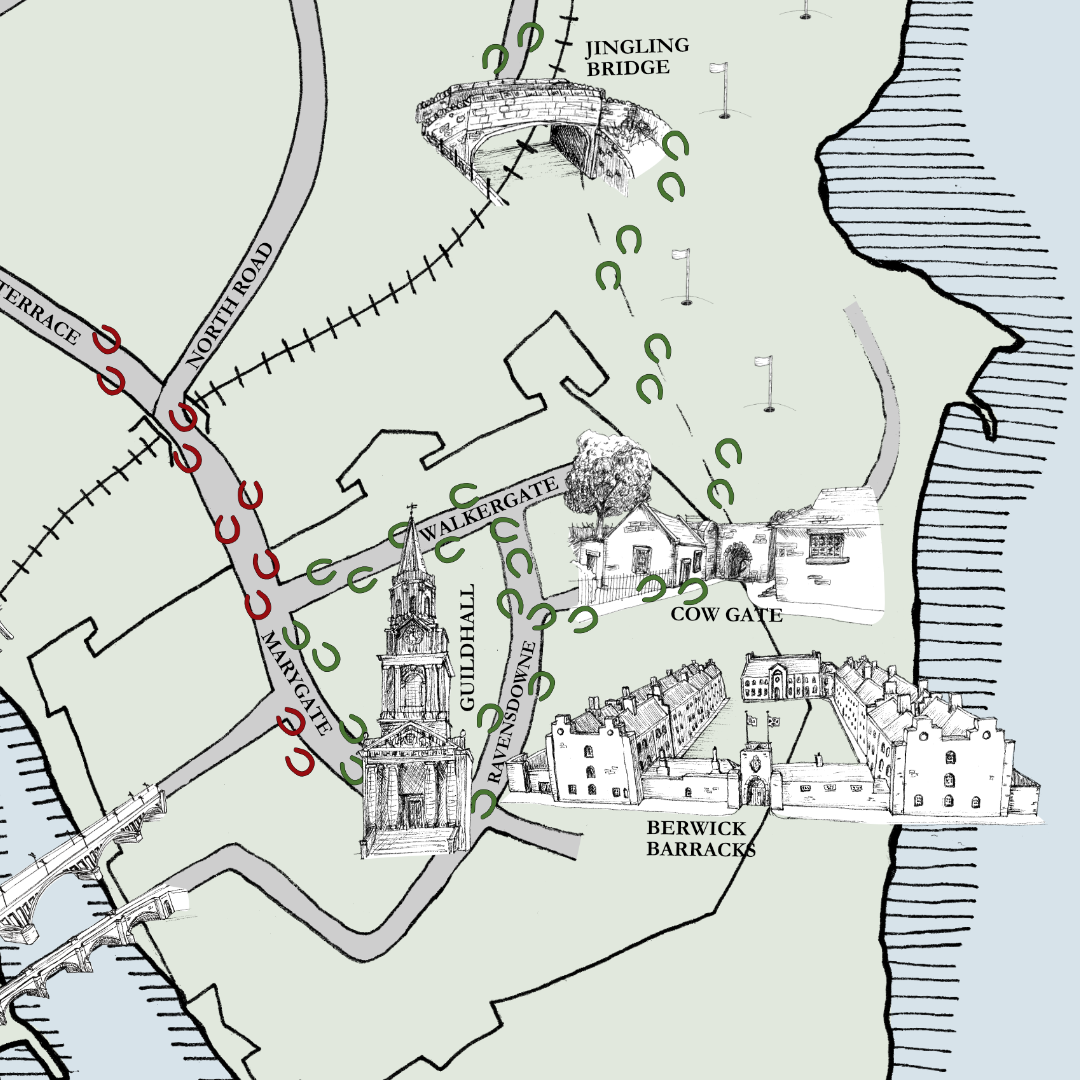

By the time I reached what I think of as the “Gainslaw Gallop” stage of the process, things had begun to feel better. I decided to keep the base map in a limited palette, using flat digital colour behind my hand-drawn ink lines, and with monochrome map icons so that my ‘active’ illustrations of the heritage event stood out more. Adding these splashes of colour brought warmth and coherence and small details, such as the hoof mark to show the route, started to connect the whole composition. Finally, as the Chief Marshall returns the the town flag to the Major to mark the end of their journey, I completed my own: the finished illustrated map of the Riding of the Bounds.
Visual Language
The other part of this project was to design x10 icon-style illustrations related to riding and the Berwick Riders Association. These were primarily to be used on the new website and needed to blend function and storytelling to create a coherent visual language.
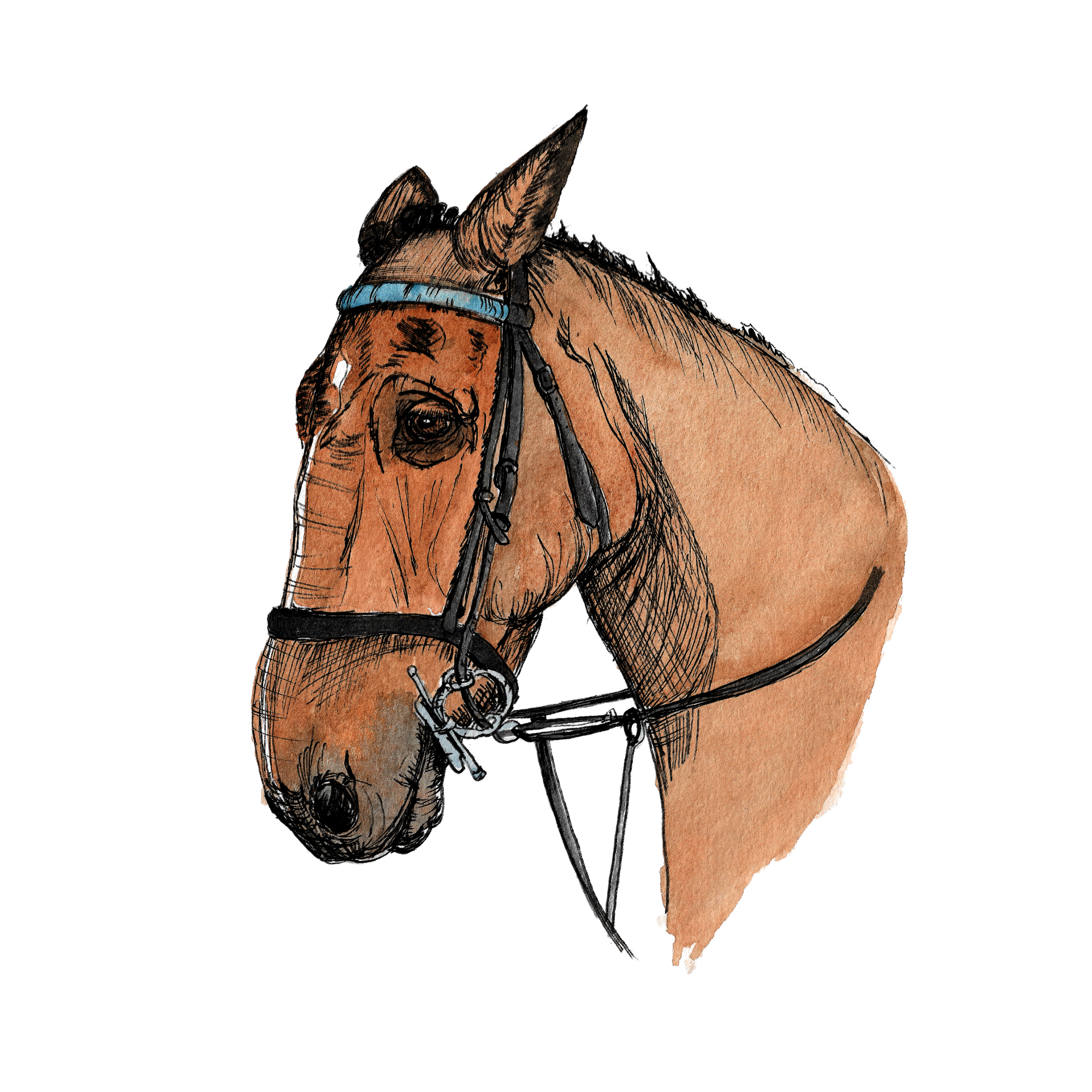
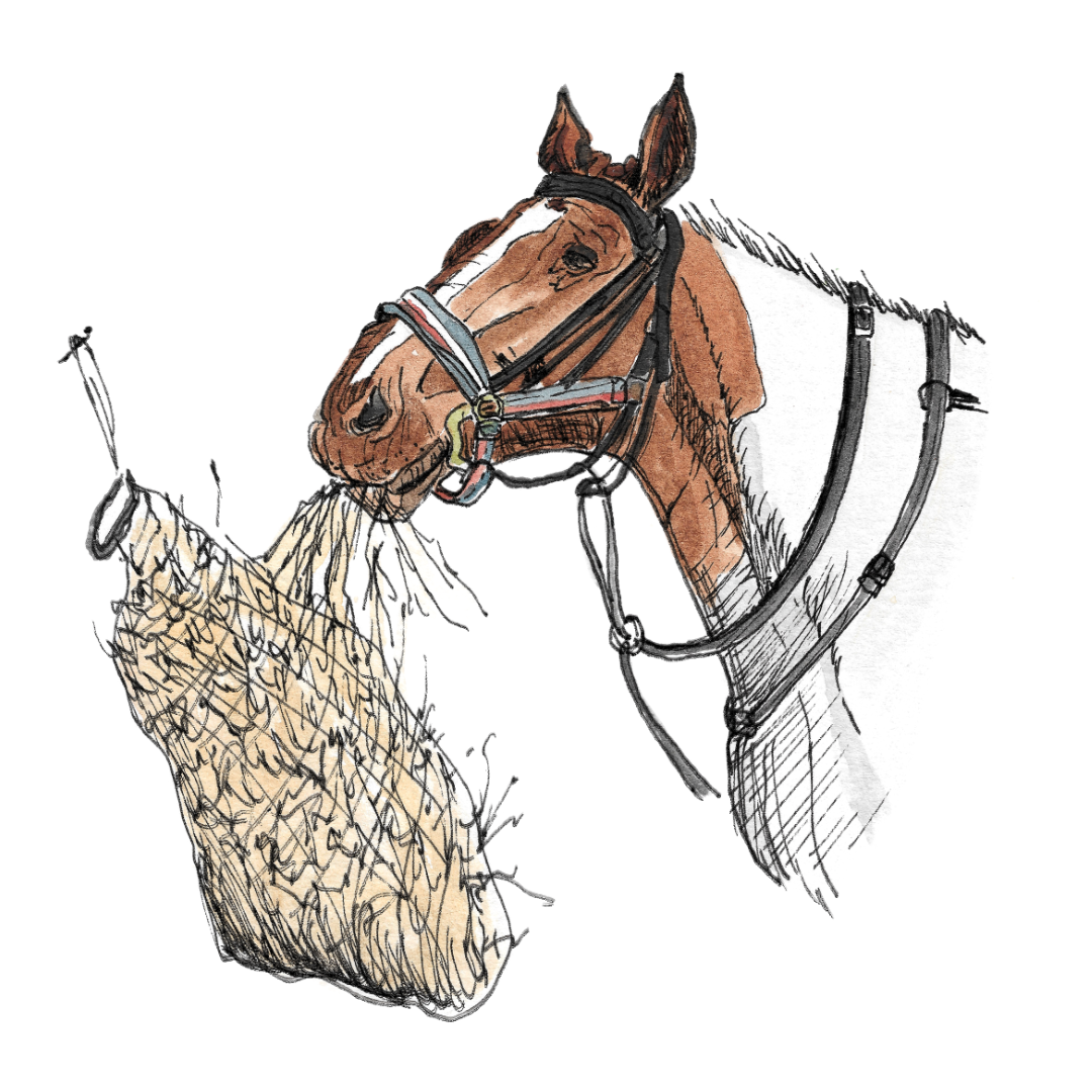
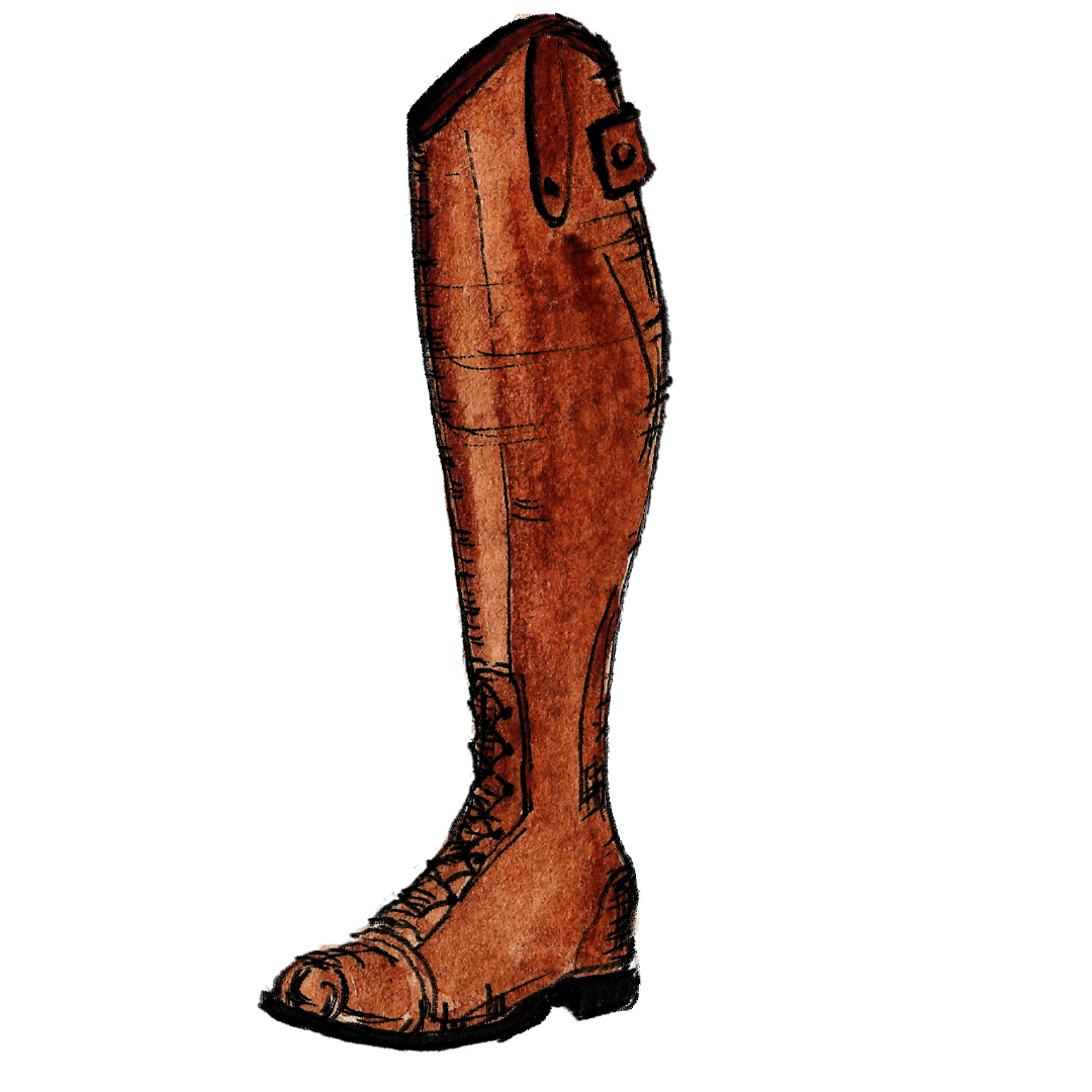
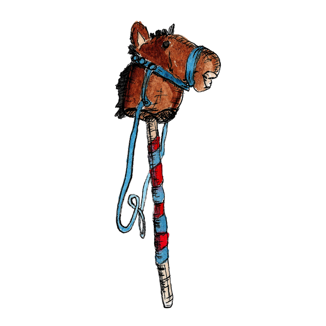
The icons I created were a horse shoe, a horse’s head, a hobby horse, a rosette, a trophy, a piper, bunting, a flag, a banner with ‘safe oot, safe in’ (the motto of the event) and a riding boot.
They were all drawn by hand in black ink, before I added watercolour detail.
You can see all of my icon illustrations on the Riding of the Bounds website.
Safe Oot, Safe In
Working on the Riding of the Bounds map was more than a design task — it was about capturing the essence of a long-standing local tradition - part of Berwick-upon-Tweed's living heritage. Every detail, from the route to the small illustrated icons of horses, rosettes, and bagpipers, was created to reflect the event and the people who make it happen. Illustration in projects like this is about clarity, storytelling, and helping a community’s story be seen and understood.
Collaborating with the Berwick Riders Association and Sarah Jamieson made the process straightforward and enjoyable. Their knowledge of the event and Sarah's beautiful photographs provided me with some amazing visual references. Projects like this are why I love working with heritage groups, volunteer-led organisations and community initiatives!
“I commissioned Ali from Coostie Illustration and Design to create a detailed illustrated map of the Riding of the Bounds route, along with a set of icon illustrations for the new Berwick Riders Association website. From the very start, Ali understood exactly what I was hoping to achieve. She interpreted the brief with real care, capturing both the heritage and the spirit of the event beautifully.
Communication throughout the project was excellent - Ali was collaborative, detailed, open to ideas, and brought her own creative insight that really elevated the final outcome. Her paperwork and contract were clear, fair, and easy to understand, which made the whole process smooth from start to finish.
After the large map was finalised, one of the committee members noticed that a rider’s outfit represented a different area. Ali corrected it for us within hours, which was incredibly impressive and professional.
The finished artwork looks absolutely fantastic. It’s about to be released to the public, and both the committee, the funders and I are delighted with how it’s turned out. It’s going to be a wonderful addition to the Riders’ website and future events.
It’s been a real joy collaborating with Ali, and I wouldn’t hesitate to recommend her to anyone looking for artwork that’s beautifully crafted, thoughtful, and full of heart.”
Sarah Jamieson, Commissioner
If your organisation is looking to bring a story, tradition or community project to life through illustrated maps or bespoke illustrations, I’d love to help. Whether it’s mapping a route, creating visual icons, or illustrating an event, the goal is to produce work that is clear, useful, and reflects your story.
Riding of the Bounds Collection

I had so much fun working on this commission that I couldn’t leave it alone!
I decided to re-work the primary map illustration to simplify it and add some narrative to explain the various activities and this is now available as an A3 or A4 print. There is also a set of 4 note cards - each featuring a different element of the Riding of the Bounds - printed on eco-friendly card stock and complete with kraft envelopes.